


AI Travel Mobile App Figma
How to Design an AI Travel Mobile App in Figma: A Practical Step-by-Step Guide
My first attempt at a travel app design looked great and was completely useless.The home screen had a gorgeous beach photo, a search bar and a floating “Plan my trip” button. I was proud of it. Then a friend tapped through my prototype and asked a simple question: “What happens after I press the button?”
I had no answer. I had designed a pretty front door and forgotten the house behind it.If you’re planning an AI travel mobile app in Figma, this guide is the one I wish I’d had. I’ll walk through how I’d approach it now, the mistakes that cost me days, and where Figma’s own AI tools genuinely help (and where they don’t).
First, decide what the AI actually does
This is the step most people skip, and it’s the one that matters most.
“AI travel app” can mean very different things. Before you open Figma, write one sentence that completes this: “The AI helps the traveler to…”
Some realistic options:
- Build a day-by-day itinerary from a short prompt
- Suggest places based on mood, budget and weather
- Rearrange the plan when a flight is delayed or it rains
- Answer questions like “Is this area safe to walk at night?”
Pick one main job and one or two supporting ones. When I tried to design all four on day one, my screens turned into a cluttered mess. A tight scope makes everything else easier.
Set up your Figma file the right way
A messy file slows you down more than any design problem. Here’s the structure I use now:
- Create three pages: Research & Notes, Components, and Screens.
- Choose a phone frame and stick with it. Around 390 x 844 (a common modern iPhone size) works well for most designs, and you can test smaller sizes later.
- Set up color and text styles first. Pick one primary color, one accent, two neutrals and a single typeface. Travel apps look best when they stay simple.
- Use variables for colors and spacing if you’re comfortable with them. When a client says “make the blue warmer,” you change it once instead of in forty places.
- Name layers as you go. Future you will be grateful.
Map the flow before drawing screens
I now sketch the journey on paper (or in FigJam) before touching the design canvas. For an AI travel app, a simple flow looks like this:
- Welcome and sign-up
- Tell the app about your trip (destination, dates, budget, interests)
- AI generates a plan
- Traveler reviews and edits the plan
- Saved trip, map view and daily view
- Live updates during the trip
That last part is where my first design fell apart. Travel is messy. Plans change. Your design has to handle that.
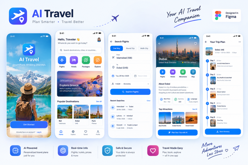
The core screens to design
Here’s a practical list that covers most travel apps:
1. Onboarding (2-3 screens). Ask only what the AI truly needs. Travel style, budget range and interests are usually enough. Long questionnaires make people quit.
2. Home screen. Show upcoming trips and one clear action to start a new plan. Resist the urge to add ten sections.
3. Trip input screen. This is where the AI conversation begins. I like a mix of a text box (“Five days in Lisbon, love food and walking”) and quick-select chips for budget and pace. People type less when you give them shortcuts.
4. Itinerary view. The star of the app. A day-by-day timeline with time, place, travel time between stops and a small photo works well. Make every item tappable.
5. Map view. Pins matching the itinerary, with a card at the bottom that shows the selected stop.
6. Place detail. Photos, opening hours, price level, and a short “why the AI suggested this” line.
7. Edit and swap screen. Let travelers replace a stop, move it to another day or ask the AI for an alternative.
8. Saved and offline. Travelers lose signal. Show clearly what’s available offline.
Don’t forget the AI states (this was my biggest lesson)
Here’s something that surprised me. Most of the work in an AI product isn’t the happy path. It’s the in-between moments.
For every AI feature, design these states:
- Loading. A blank spinner for ten seconds feels broken. Show progress like “Finding places near your hotel…” so it feels alive.
- Empty. What does the screen look like before the AI has suggested anything?
- Error. “Something went wrong” is useless. Say what happened and what to do next, like “We couldn’t build your plan. Check your connection and try again.”
- Low confidence. If the AI isn’t sure (for instance, a restaurant’s hours might be out of date), show a gentle note and a link to verify.
- Regenerate and undo. Let people try again without losing their edits.
This is also where trust is built. Travelers are making real decisions with real money, so be honest in the interface. A small “Check opening hours before you go” line is better than pretending the AI is always right.
Build reusable components
Once you have two or three screens, stop and turn repeating parts into components:
- Select an itinerary card and press the component shortcut.
- Turn on auto layout so the card grows with its content (a long place name shouldn’t break the design).
- Create variants for states like default, selected and saved.
- Do the same for buttons, chips, input fields and bottom navigation.
I skipped this on my first project and spent an entire afternoon manually changing corner radius on 30 cards. Don’t be me.
Prototype it so people can actually tap through
Figma’s prototype mode is where your design starts to feel real:
- Switch to the Prototype tab.
- Connect buttons to the next screens with simple “on tap” interactions.
- Use Smart Animate for smooth transitions, like a card expanding into the place detail.
- Fake the AI. Create a loading screen that moves to the finished itinerary after a short delay. Users will understand the idea without a working backend.
- Test on your actual phone with the Figma mobile app.
Testing on a phone changed my design more than any other step. Buttons I thought were big enough were awkward to reach with one thumb.
Where Figma’s AI tools help (and where they don’t)
Figma has added AI features in recent years, and their availability depends on your plan and region, so check what your account includes. In my experience they’re best for speeding up boring tasks:
- Renaming layers and organizing messy files
- Filling in placeholder content, like realistic place names and descriptions
- Generating a first draft of a screen from a prompt, which you then rework
- Figma Make, a separate prompt-to-prototype tool that can create a working, clickable version from text or from your design
A tip if you try prompt-based tools: be specific. Instead of “make a travel app,” try something like “mobile travel planner with a home screen showing upcoming trips, a prompt box for new trips, and a day-by-day itinerary view.”
Here’s the honest part. AI-generated screens often look generic, and complex flows can get misread, so treat them as a rough sketch. I use them to get unstuck, then redesign with my own judgment. The thinking about who the traveler is and what they need still has to come from you.
For related tools, people also use Uizard, Visily and Lovable for quick concepts. They’re worth trying, but Figma remains the easiest place to polish and collaborate.
Check accessibility and real-world use
Travelers use apps outside, in sunlight, while walking, often with one hand. A few quick checks:
- Contrast: light gray text on a photo is hard to read in bright sun.
- Tap size: keep buttons comfortably large, roughly 44 px or more.
- Text size: don’t make key info tiny.
- Maps and photos: always provide text alternatives for key information.
- Languages: if your app is global, test long words. German and Finnish labels will break tight buttons.
Common mistakes to avoid
Designing only the happy path. Plans change, flights get canceled and AI makes mistakes. Design for them.
Stuffing in too many features. Pick the one thing your app does best.
Using stock-photo perfection everywhere. Real photos are messier. Test your design with actual photos of places, not just polished ones.
Ignoring privacy. Travel apps use location and personal data. Explain in plain language why you’re asking for permissions, and let users say no.
Skipping user testing. Even five minutes with a friend will show problems you can’t see.
Forgetting the developer. Clear naming, consistent spacing and documented states save everyone time. Use Dev Mode to share specs and assets, and include notes about what the AI should do in each state.
A simple one-week plan
If you want to start today, here’s a realistic schedule:
- Day 1: Define the AI’s main job, write the user flow.
- Day 2: Set up the file, styles and basic components.
- Day 3: Design onboarding, home and trip input.
- Day 4: Design the itinerary, map and place detail screens.
- Day 5: Design the AI states: loading, error, empty, low confidence.
- Day 6: Prototype and test with two or three real people.
- Day 7: Fix what you learned, then tidy the file for handoff.
Where I’d start if I were you
Open Figma and design just three screens: the trip input, the loading state and the finished itinerary. Link them in a prototype and show it to someone who travels often.
Watch where they hesitate. Those pauses will teach you more than any tutorial, including this one. Then go back and improve, one screen at a time, and the app will slowly start to feel like something people would actually use on a trip.








Leave a Reply